cripple
publishing initative by Emily Sara of sick and tired Introduction
cripple is a publishing initative exclusively supporting the endeavors of disabled artists and designers.
Logo Brief
Create a highly readable and unique logo that emodies the feeling of crip time and a disabled body. Logo will be viewed digitally, printed and on merchandise.
Team
Mia Navarro
Questions
What material withstands bending, contorting, yet still has a strong edge? How can I create a logo that showcases human touch? How can I preserve the goal of readability/ledability with handmade objects?
Keywords
Accessible, hurt, wobbly, handmade, high readability
My role
Logo creation
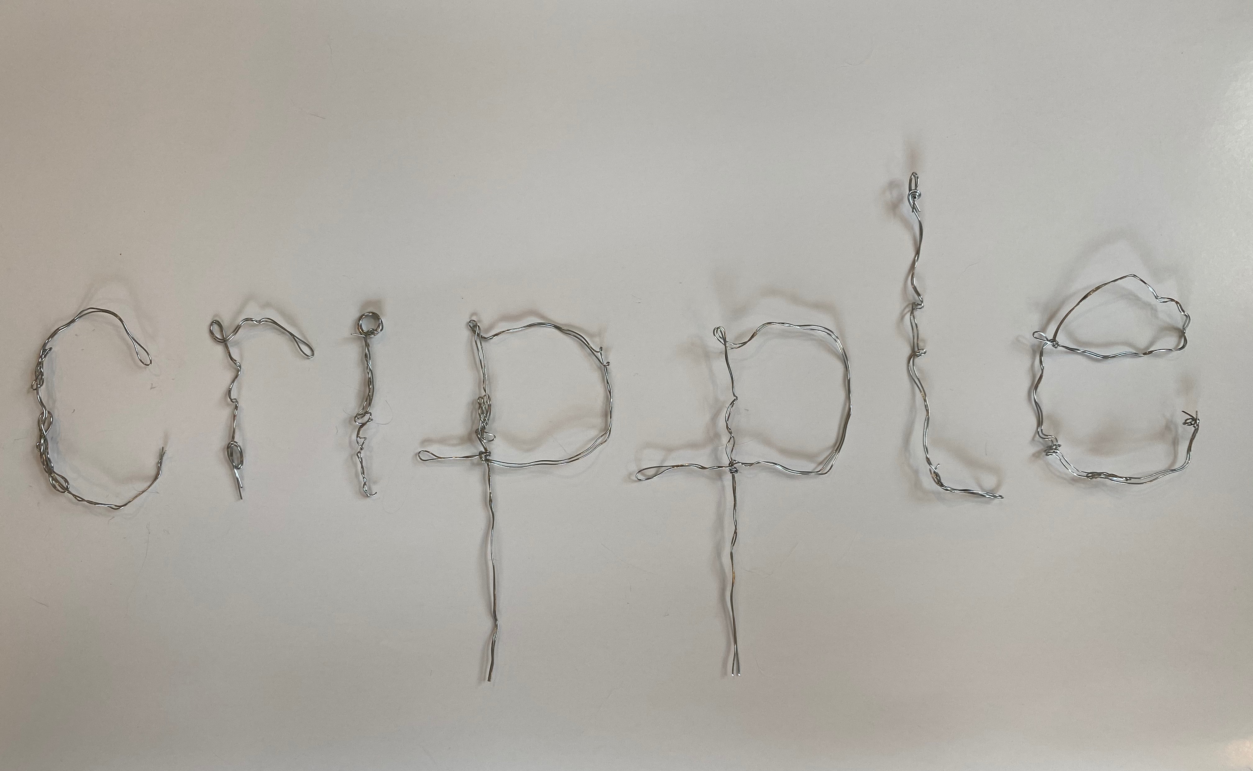
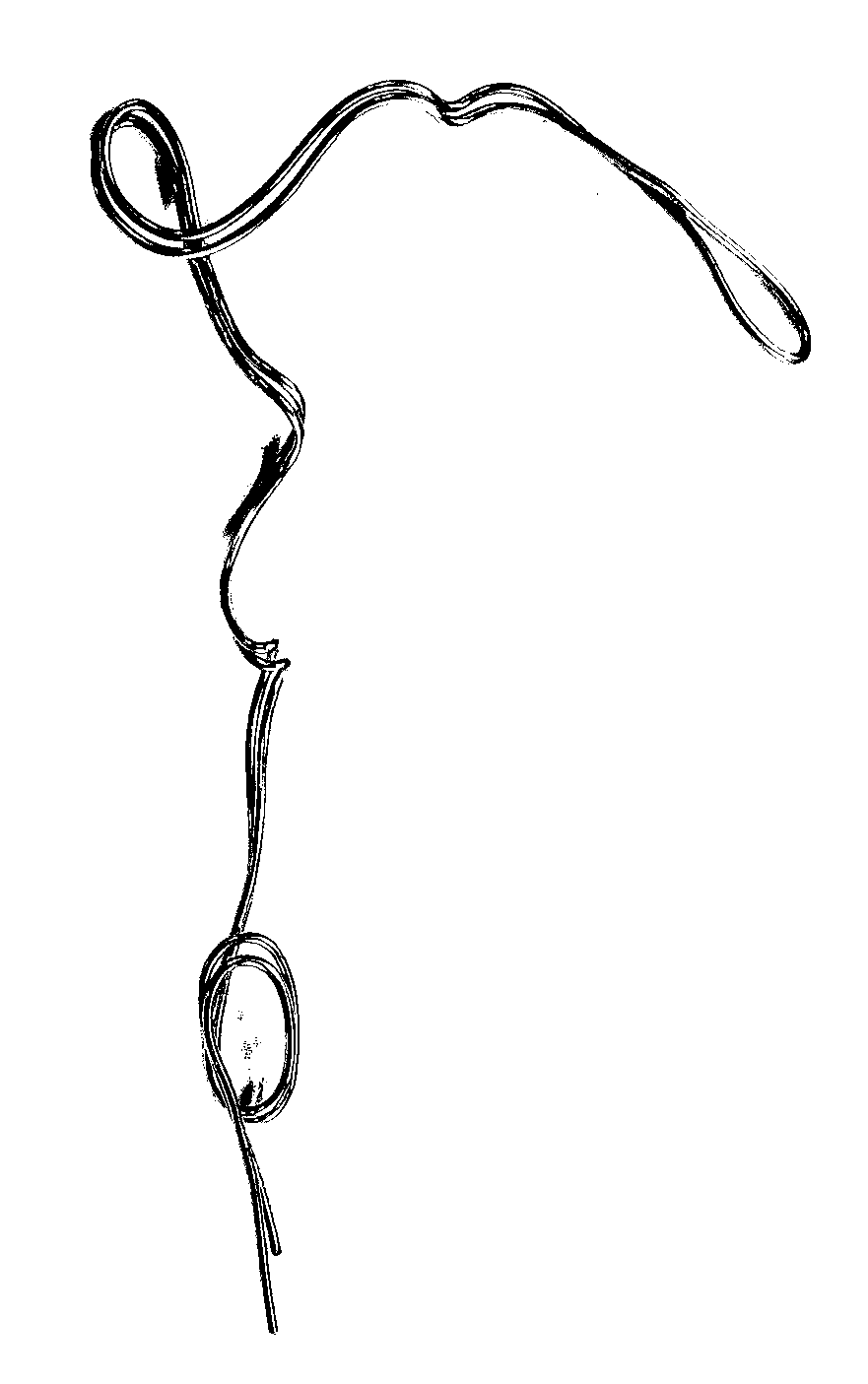
Material process
Working with wire gives me control over the shaping of letterforms and give irregularities that I would not otherwise find working digitally.
I wrapped the wire in yarn to see if the softness would communicate criptime and bed rest.
Working with wire gives me control over the shaping of letterforms and give irregularities that I would not otherwise find working digitally.
I wrapped the wire in yarn to see if the softness would communicate criptime and bed rest.

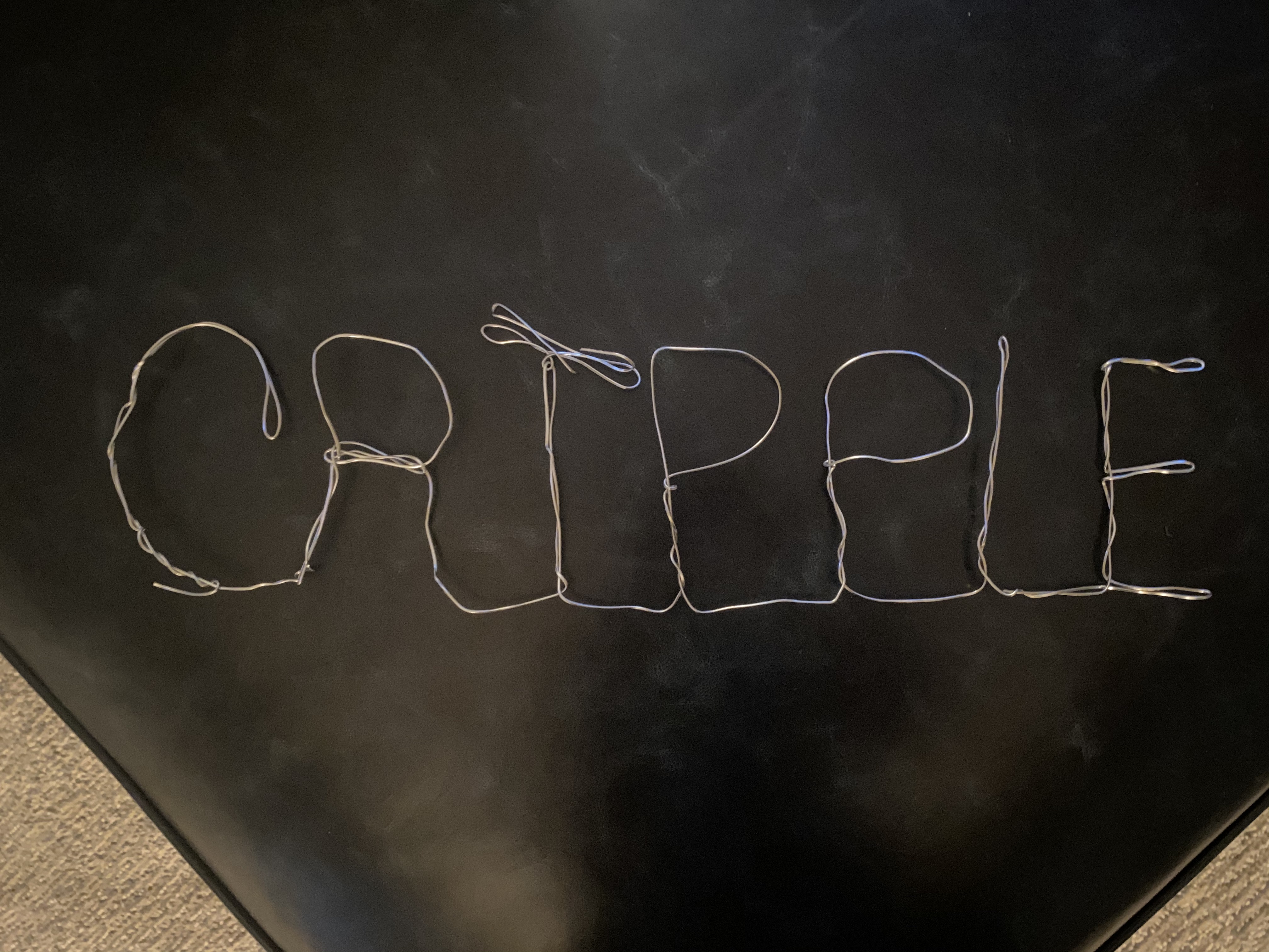

Decision of Wire vs Yarn
I took note of the intricate wrapping of the yarn and decided to coil the wire around the letter forms to make a concrete, recognizable logo. Despite loosing the softness from the yarn, the readability gained from sole wire was much more important.
I took note of the intricate wrapping of the yarn and decided to coil the wire around the letter forms to make a concrete, recognizable logo. Despite loosing the softness from the yarn, the readability gained from sole wire was much more important.
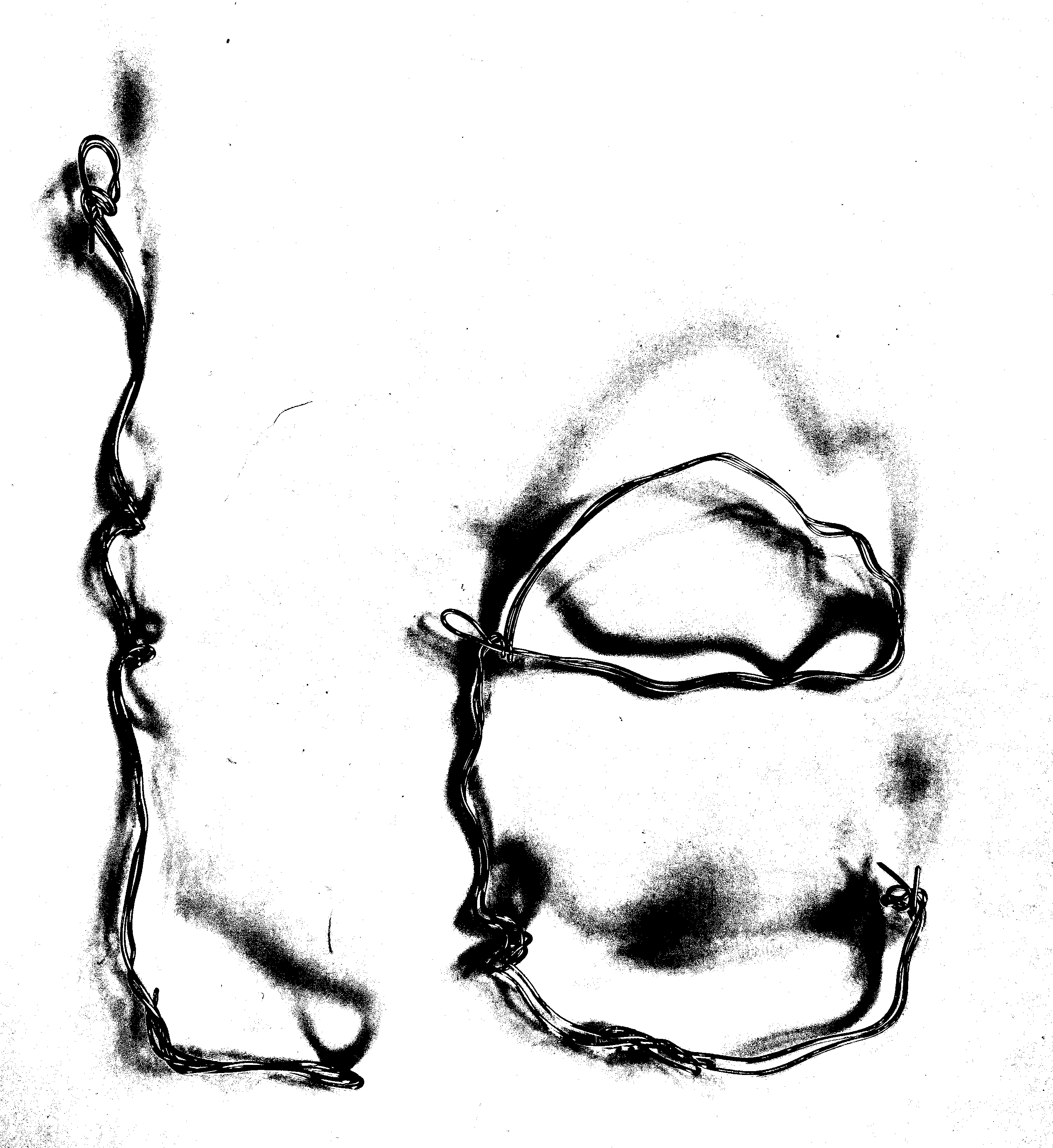
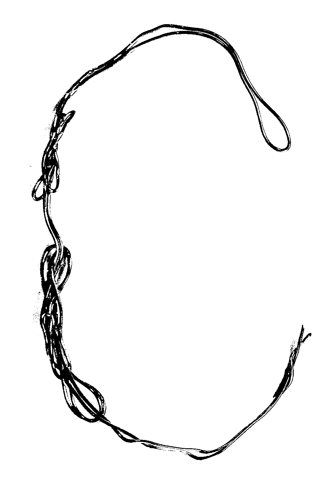
Digitizing Logo
Instead of scanning the letter forms, I documented them by photographing them on a white background. I wanted to capture the faint shadows being cast on the paper.
I moved the images into photoshop using the threshold tool to create defined b/w letters.
Instead of scanning the letter forms, I documented them by photographing them on a white background. I wanted to capture the faint shadows being cast on the paper.
I moved the images into photoshop using the threshold tool to create defined b/w letters.


Finalizing Logo
I double the letters, increased contrast, and added a grainy drop shadow to ensure its legability on different matterials.
I double the letters, increased contrast, and added a grainy drop shadow to ensure its legability on different matterials.
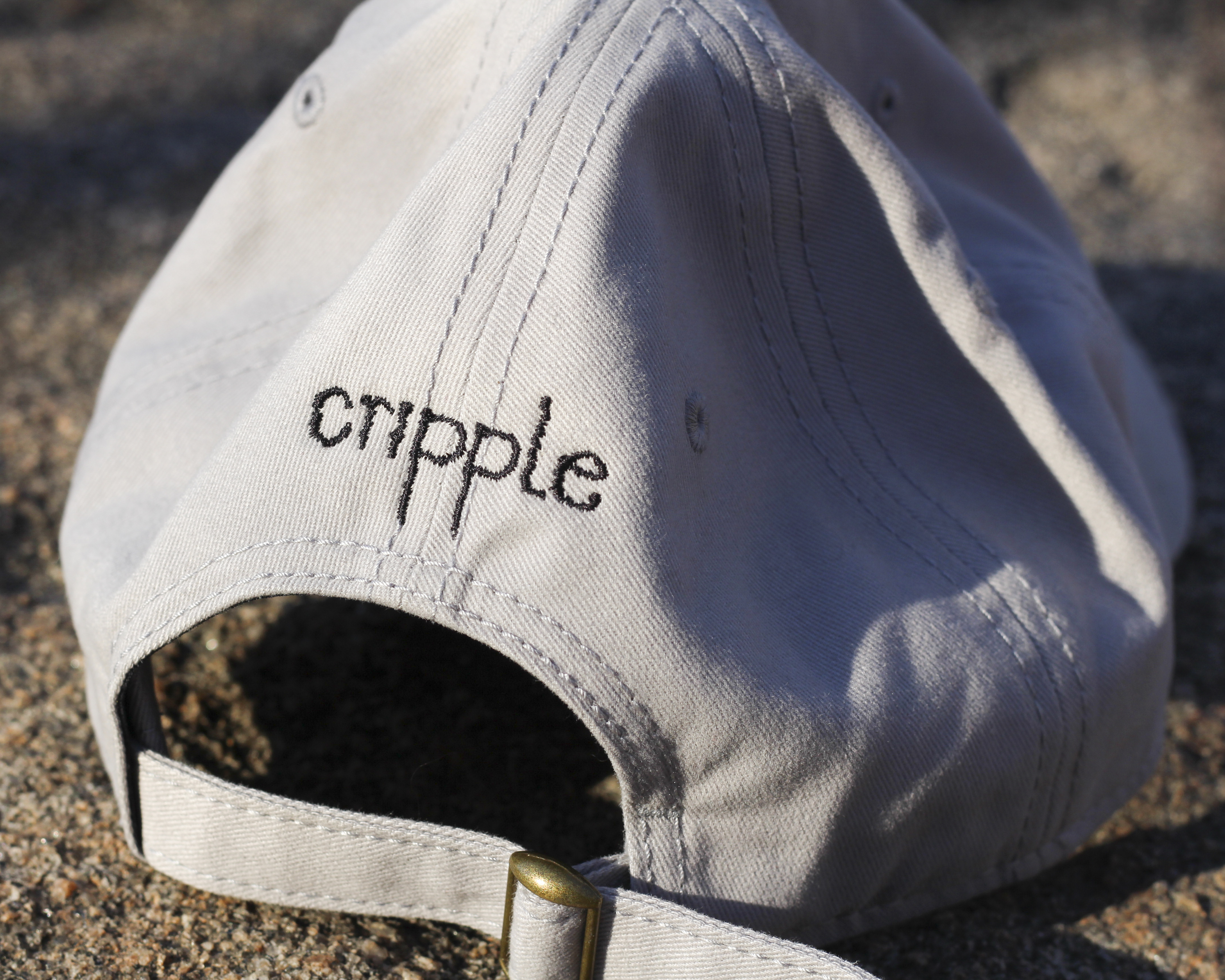
Logo on Merchandise

cripple @ New York Art Book Fair 2021
Website
When COVID19 hit, cripple and all other vendures for New York Art Book Fair had to reconfigure their table for a digital experience.
I was responsible for creating cripple’s digital table for NYABF. Using WEBAIM to check contrast, legability, and screen readers each element of the website was carefully crafted keeping accessiblity in the forefront.


