VCU Photography + Film Department
Introduction
I was selected from the Graphic Design Department to refresh the Photo + Film identity.
Brief
Build out an identity with new colors, type, class schedule, vinyl installations, and posters for visiting artist lecture series.
Team
Mia Navarro
Questions
What font is large, versitale, and accessible? What colors bring calmness and inspiration to the department? What forms represent future?
Keywords
Accessible, futuristic, inspiring
My role
Lead Designer
Vinyl Labels
I used Benton Sans as the new font family for the department. It’s range of narrow to wide and light to bold styles allowed for maximum play.
The spiral is used to represent the passing of time and the future. To ensure accessiblity, I left one number filled with color so that the spiral form didn’t take away readability.
Blue and yellow were chose as the new colors. The blue has a bold calming effect and the yellow gives the eye a visual break.


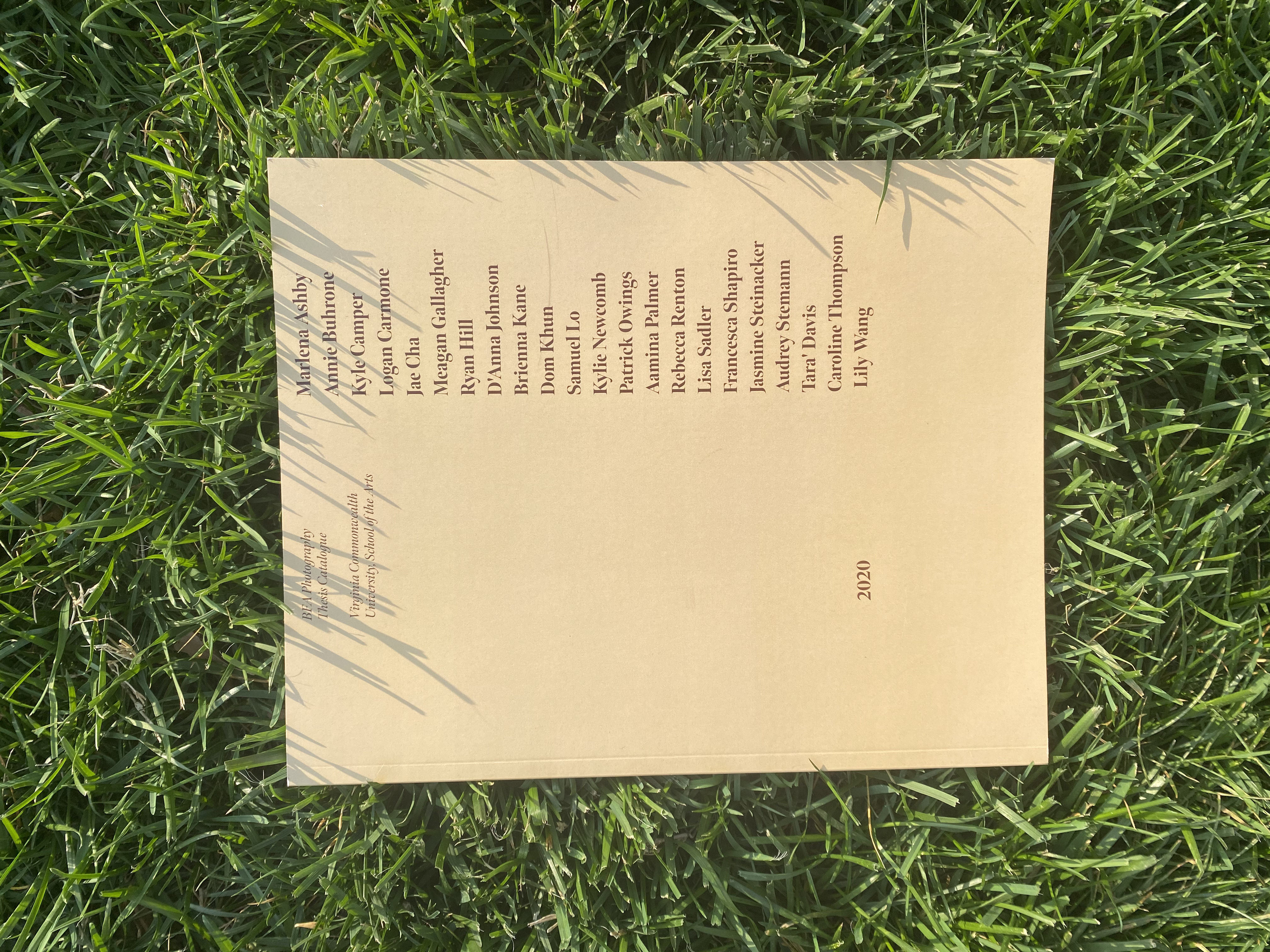
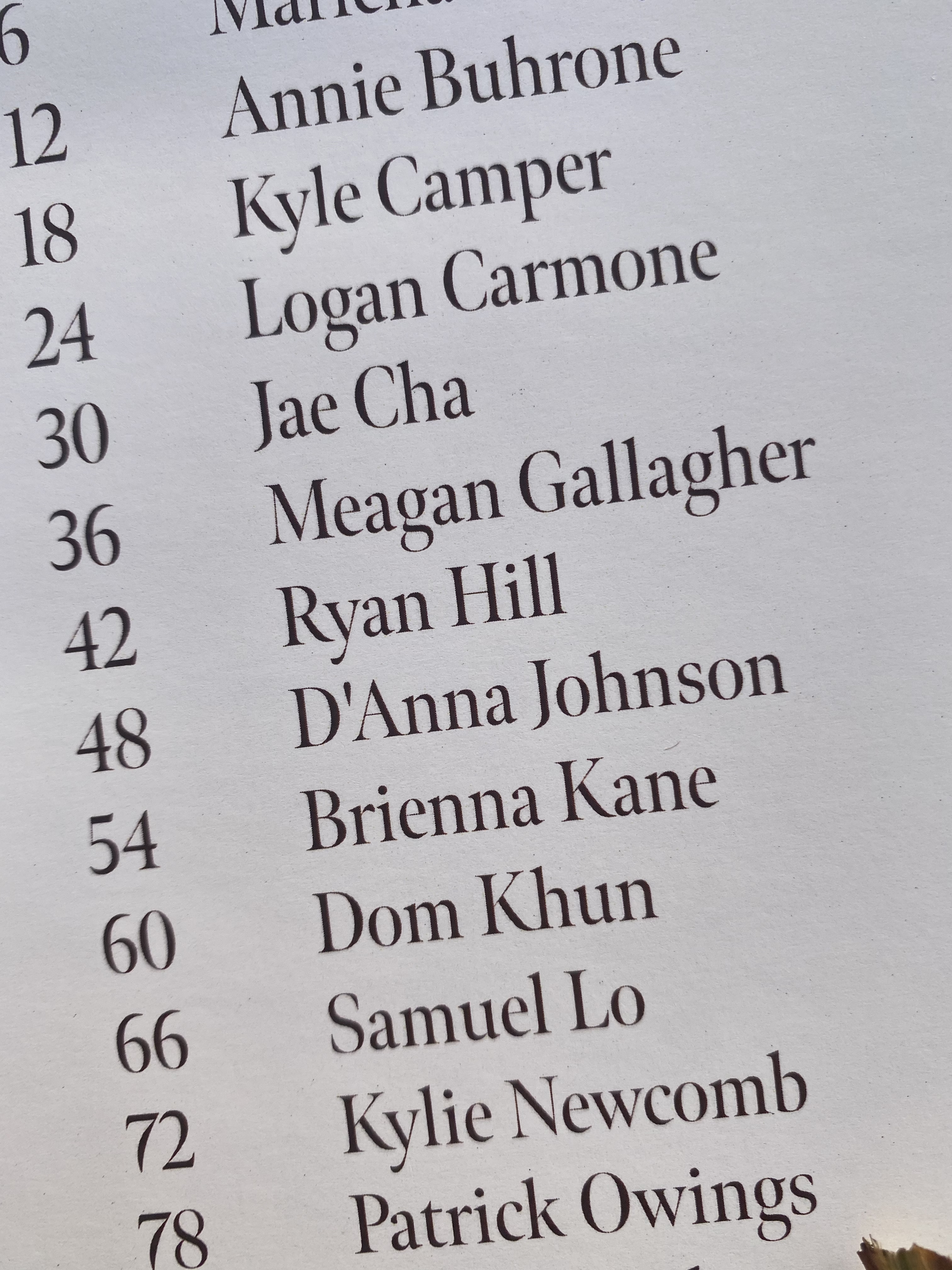
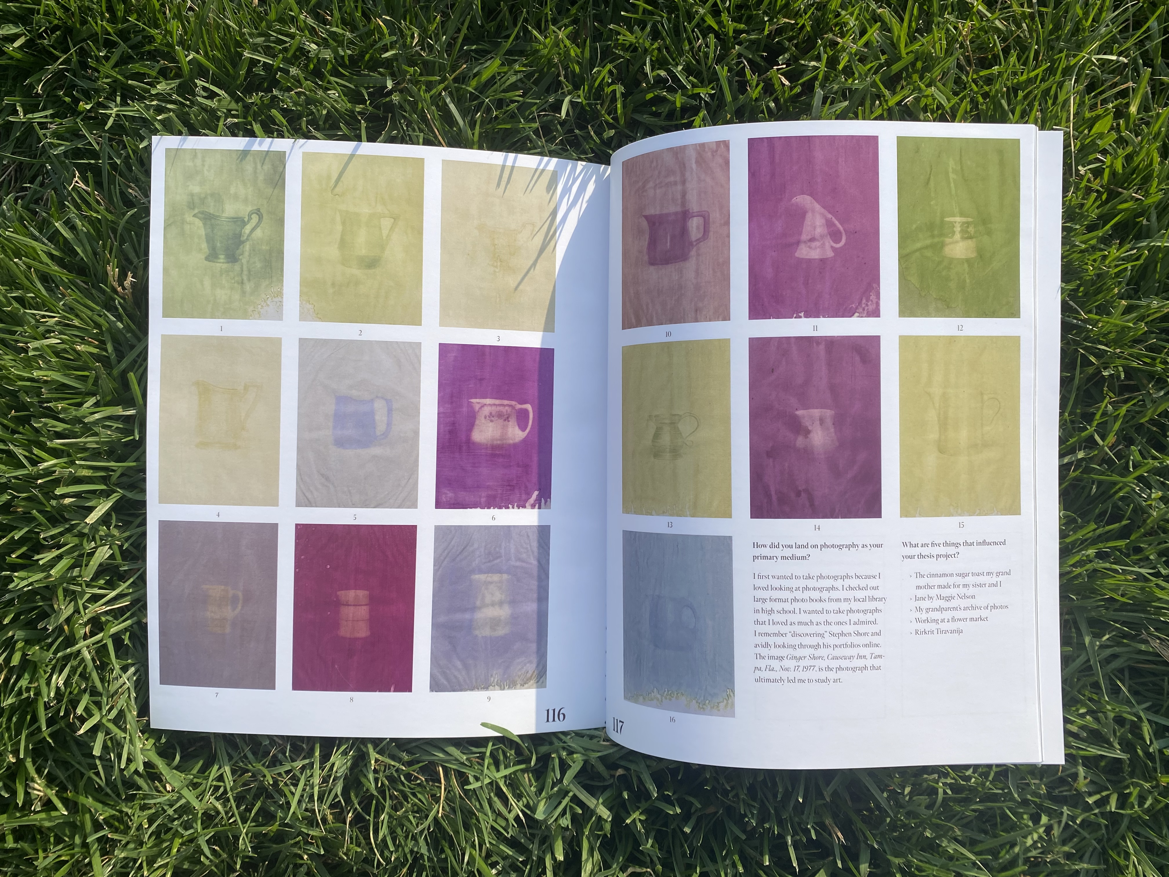
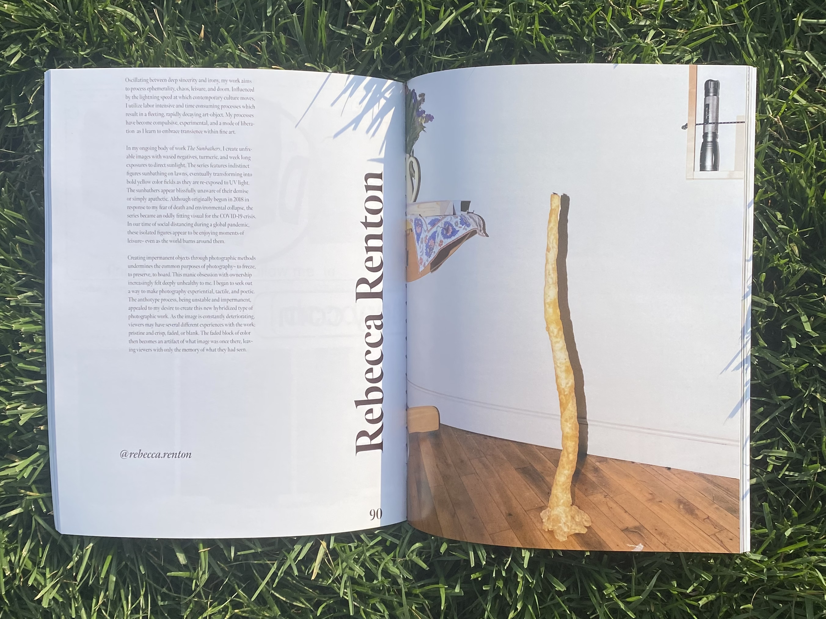
Senior Thesis Catalog
The
The

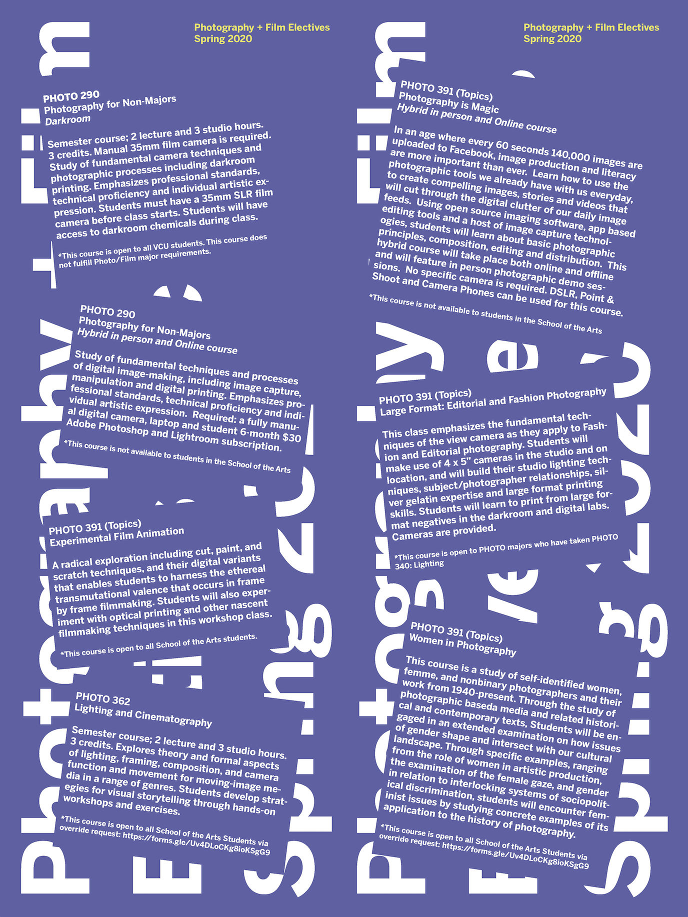
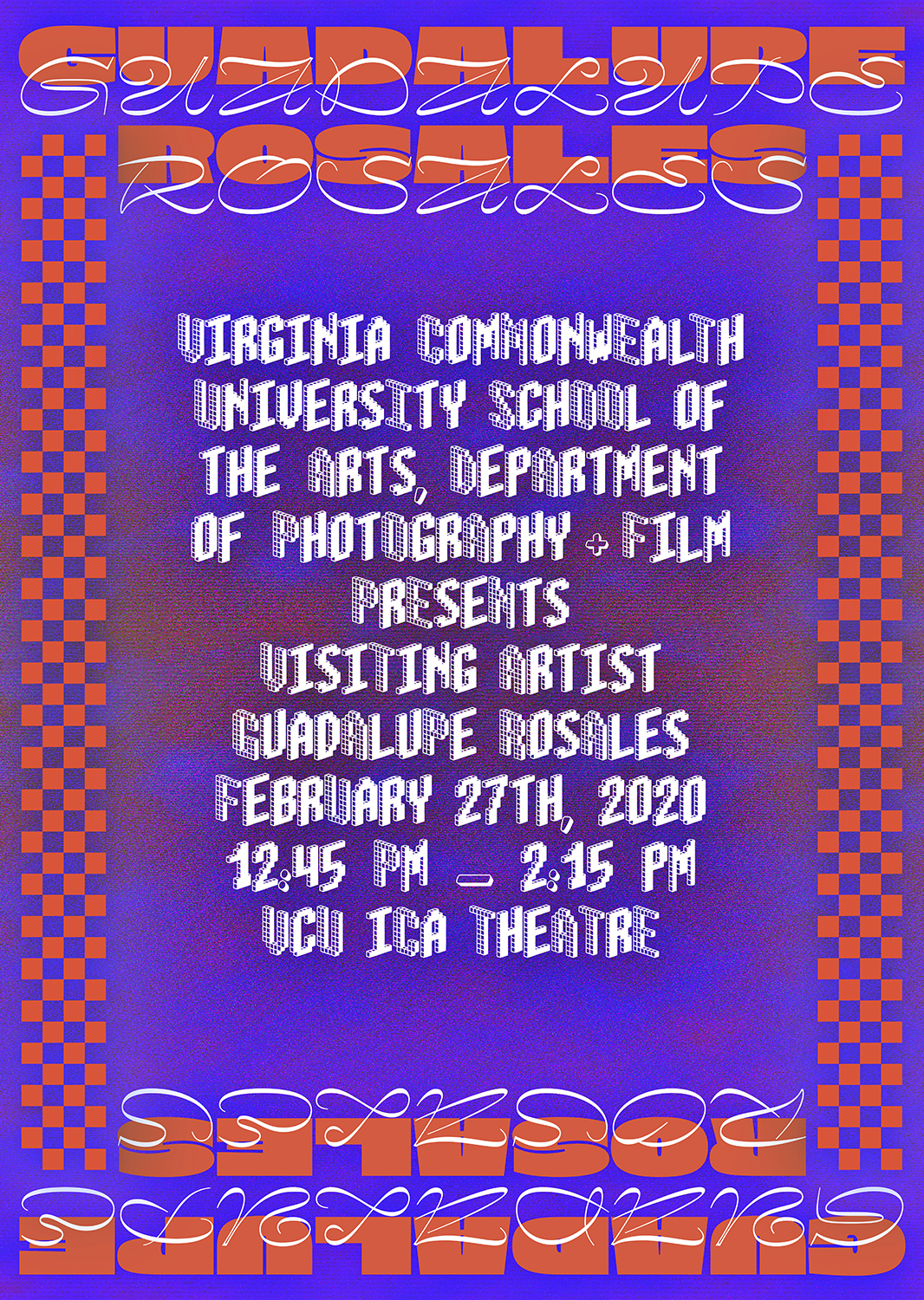
Class + Visiting Artist Lecture Posters
The goal with each poster was to maximize accessiblity and embody the departments energy and/or the visiting artists style.
When I make posters, I start with color or image first. I find that visual communication is best when the image is first and text is second. It allows me to have the image rest in the background and the text to be in the foreground. I can then focus on the type and ensure it’s accesibility.