Rethinking Art History Through Disability
Art Historian Research Group, University of Zurich
Introduction
An all female research group from the University of Zurich are hosting a workshop in June 2022 to reimagine, discuss, and present art history through the lens of disability. They are looking to transition from the university of Zurich’s hosting site to an expressive, accessible website.
Brief
Create a visually engaging, accessible site for the spring 2022 workshop.
Team
Emily Sara + Mia Navarro of sick and tired studio
Questions
How can we create an engaging and accessible site? How can we create a digital playground for the audience attending the workshop this spring? What is the quickest, least resistance layout for accessibility?
Keywords
Playful, contemporary, expressive, abstract, Large type, image descriptions
My role
Site Map
Wireframes
Graphic Assests
Layout Design
Wireframes
Graphic Assests
Layout Design
Site Map
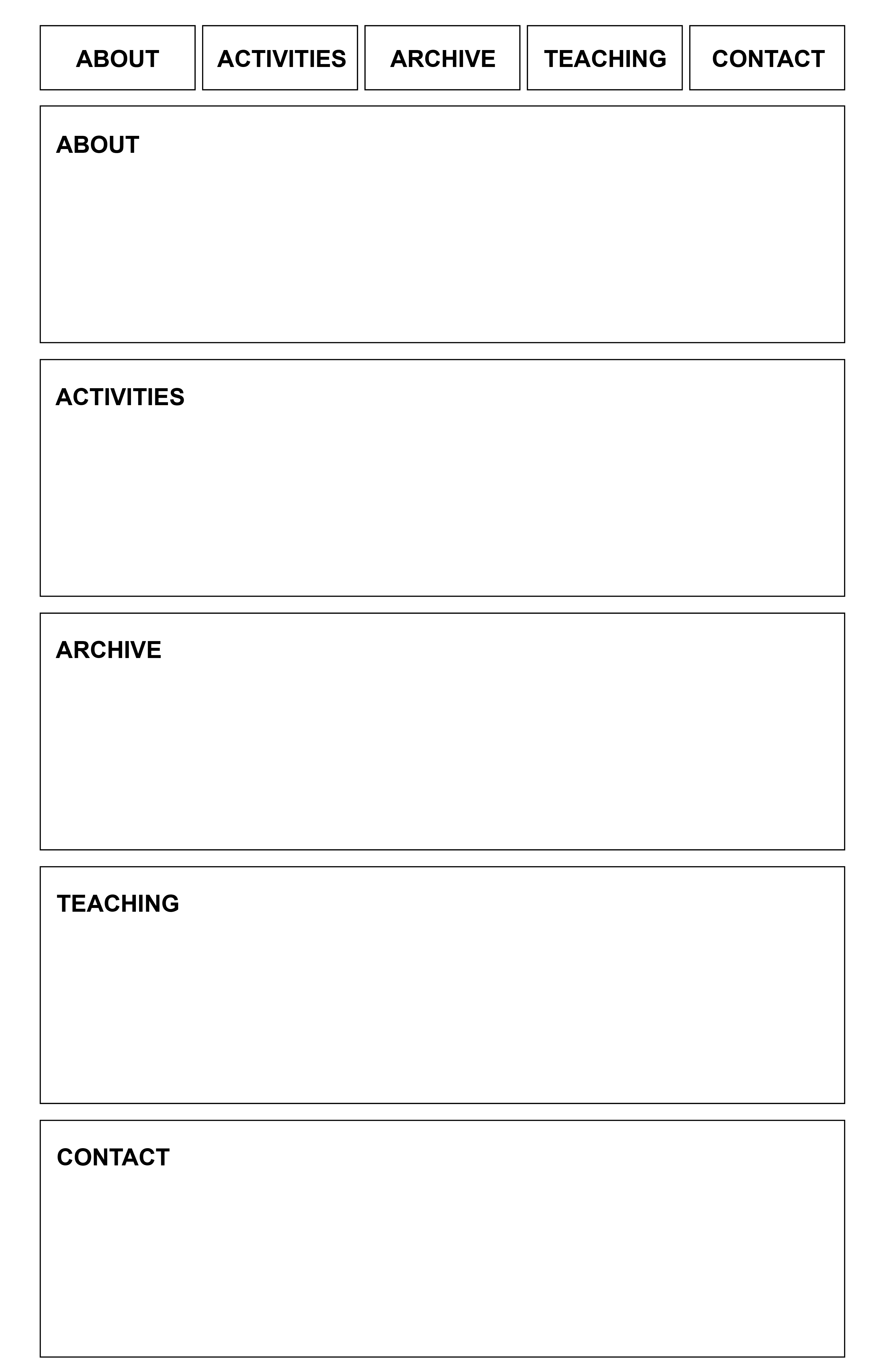
Simple diagram sent to client to display categories of site and proceeding pages within each class.
Simple diagram sent to client to display categories of site and proceeding pages within each class.

Wireframes
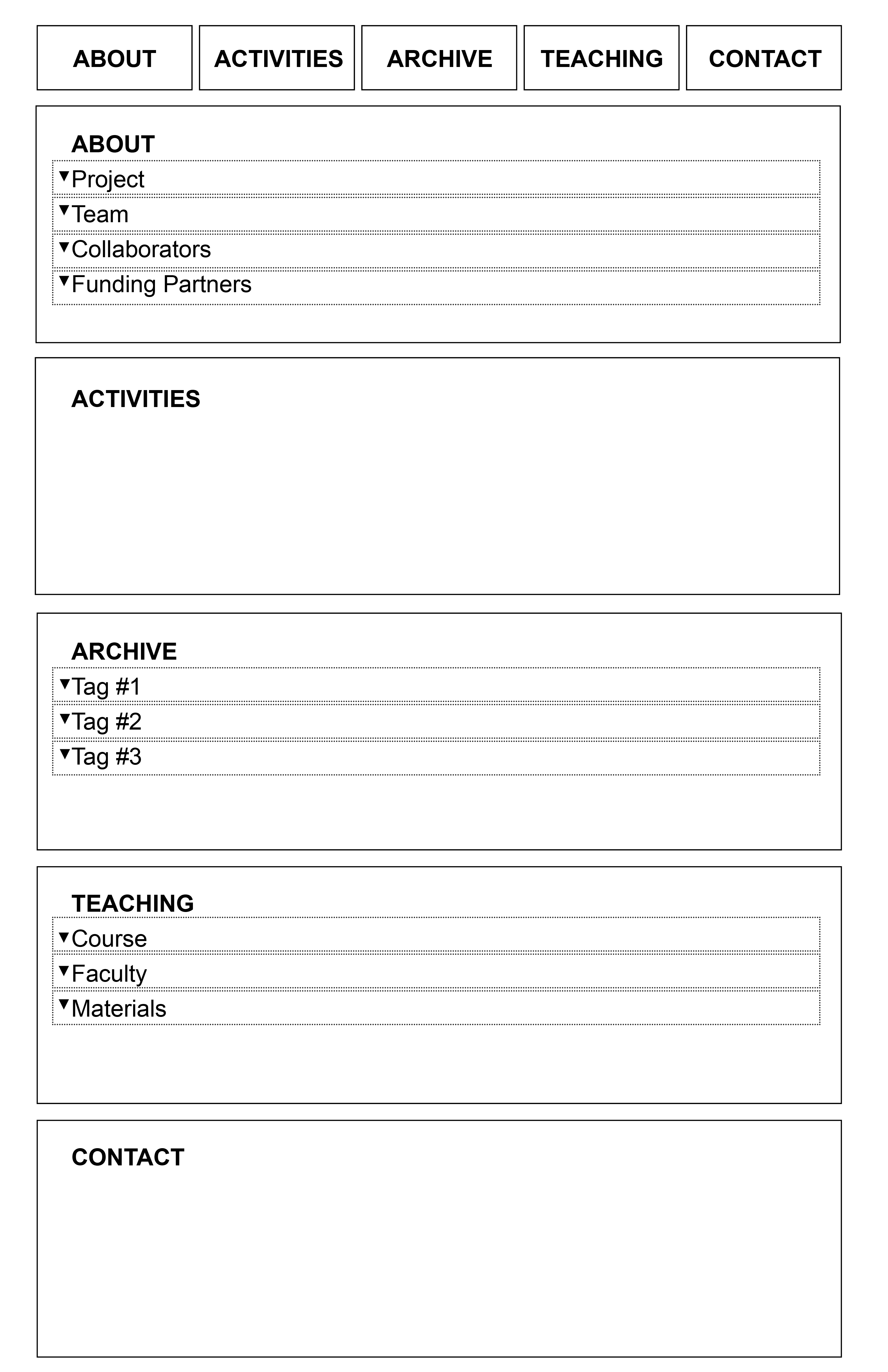
The wireframes inform how the userflow will be engaged within the site. The expanding features allows users to read more or hide away content so that there is a low barrier to visual stimulus.
Arial is the font choice due to its consistent letter width which creates easy readability.
The wireframes inform how the userflow will be engaged within the site. The expanding features allows users to read more or hide away content so that there is a low barrier to visual stimulus.
Arial is the font choice due to its consistent letter width which creates easy readability.

Graphic Assests Iteration 1
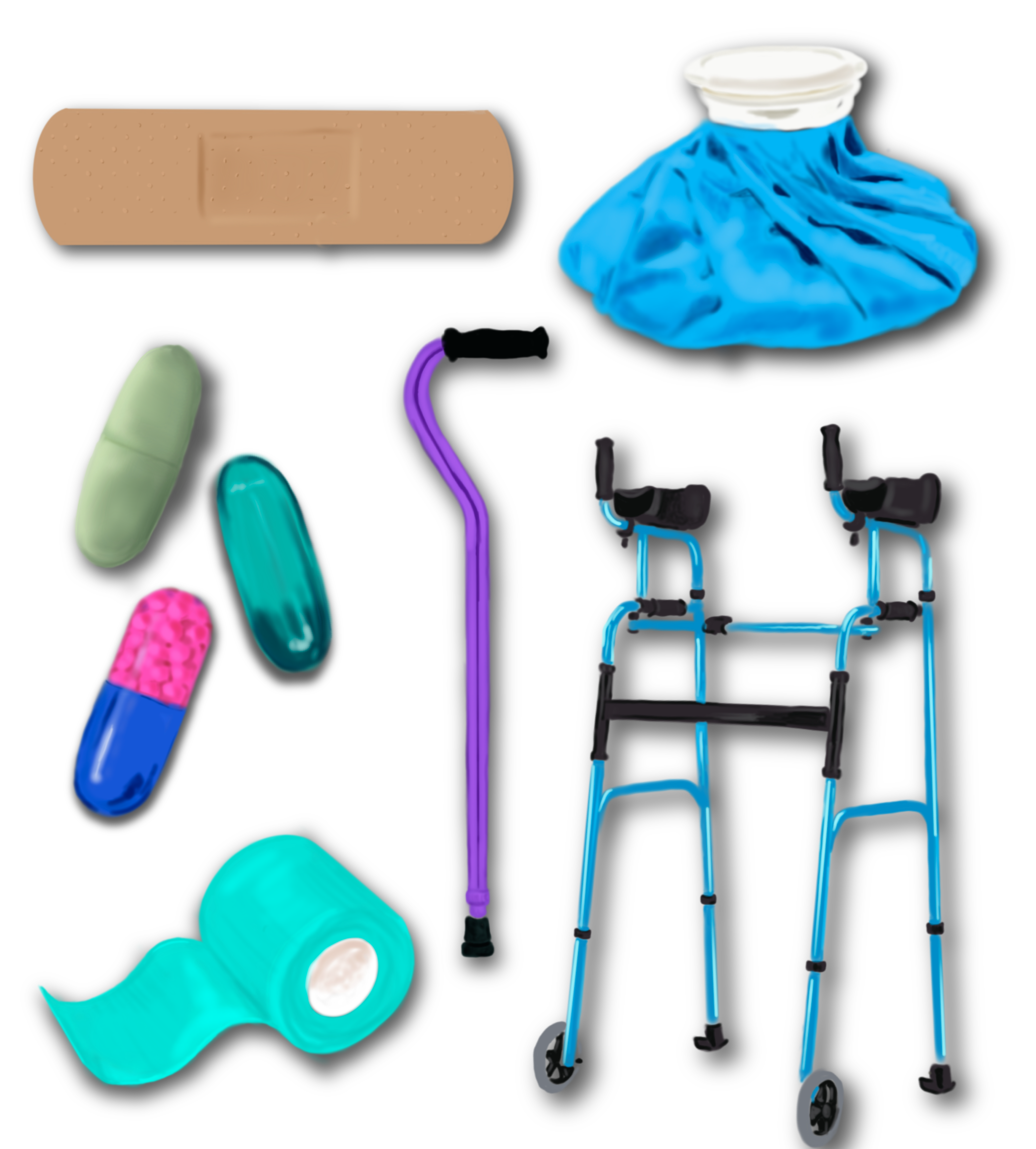
These first illustrations allowed me to begin exploring the graphic language of the disability community. I start with researching the community and ideas the client is involved with and create illustrations to help me better understand their asks.
These first illustrations allowed me to begin exploring the graphic language of the disability community. I start with researching the community and ideas the client is involved with and create illustrations to help me better understand their asks.
Design Iteration 1
Keywords: Playful, abstract
The intention for this variation was to embody an abstraction of disability. The graphic forms guesture to a metamorphic representation of rethinking art history and the amorphic shapes point to the range of what disability looks like.
In this iteration I subsituted Arial for K2D. The rounded curves and pointed strokes of the letters were a perfect fit to communicate an inviting and educational space.

Design Iteration 2
Keywords: Contemporary art world, all female team, end goal, futuristic
My intention was to abstract the graphic language and guesture towards the process of truly rethinking art history. Arial and Arial Black were used because the sharp quality of the letter forms paired well with the keywords of ‘futuristic’ and the boldness matched with the confidence of the all female team. The type is set in a blue highlight for maximum contrast and accessiblity. We also included image descriptions for screen readers.
The thin, wavy lines guestures to the natural eb and flow of research and wandering through history to redefine where we are today. The wavy images signal a new look at history. The small knot-like lines represent a meeting of the minds when the historians collaborate. The line breaks point to the end goal of the workshop.

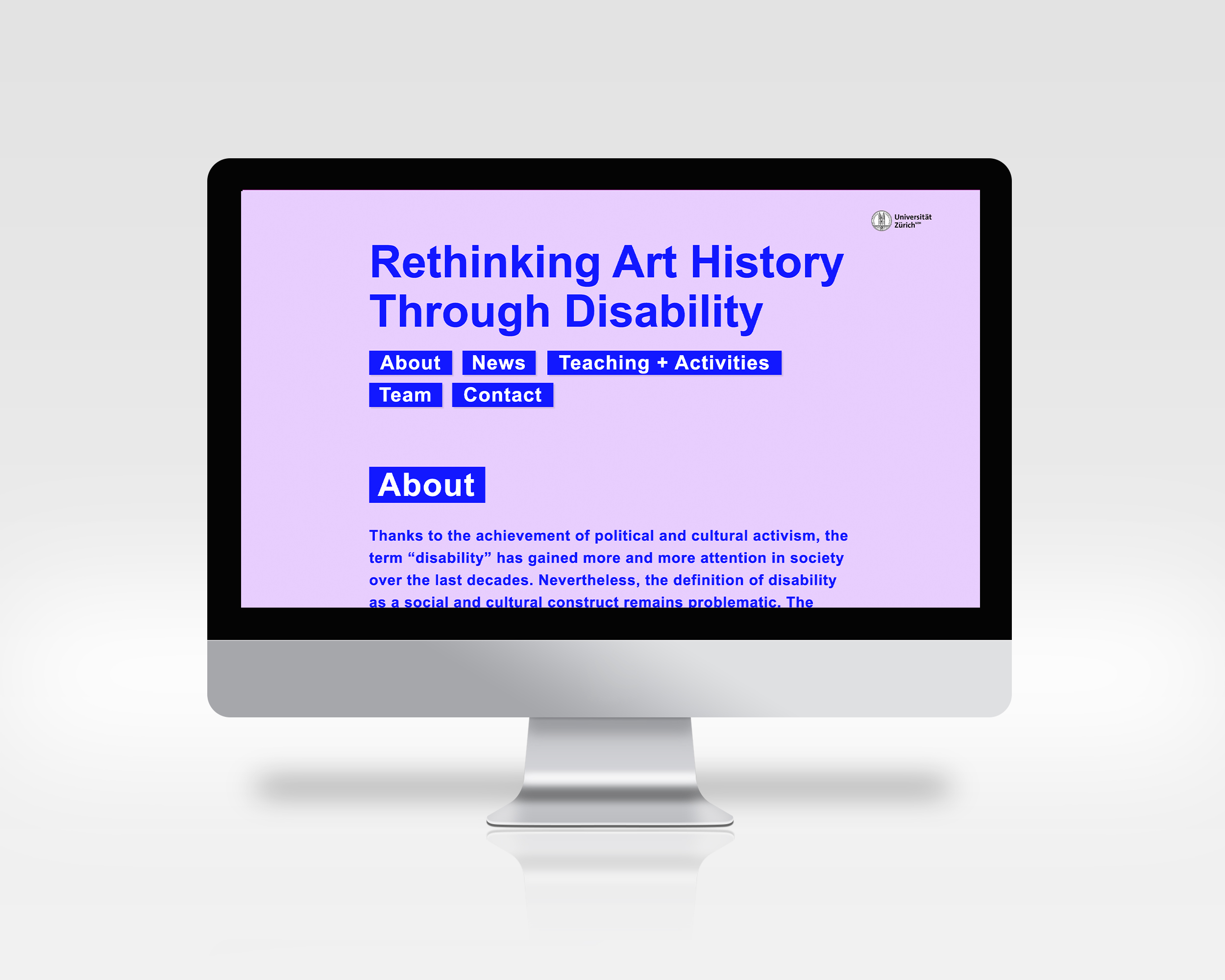
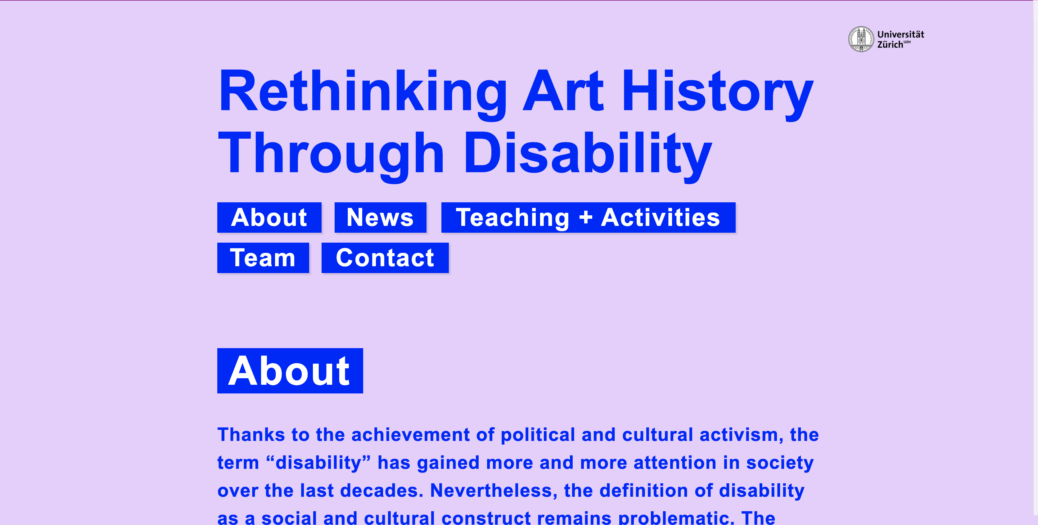
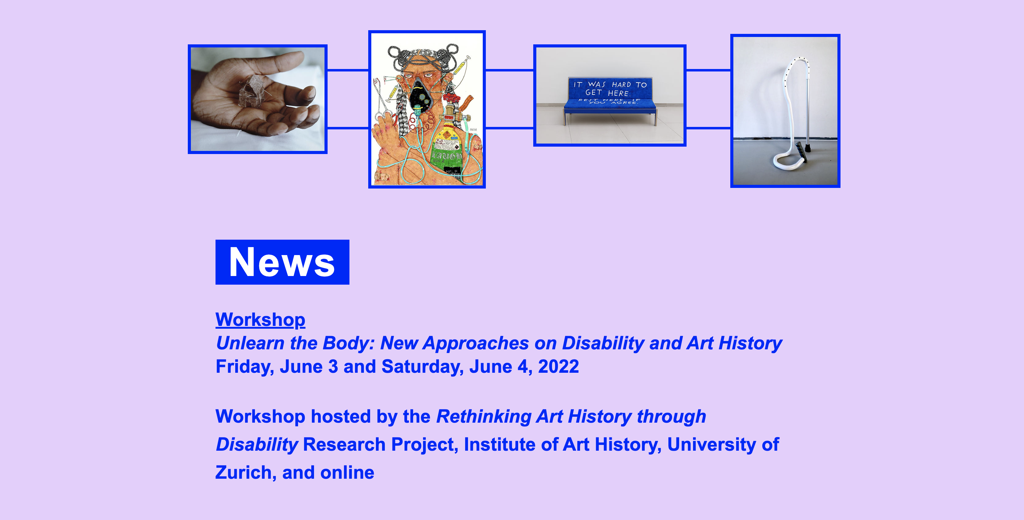
Design Iteration 3
Keywords: Simple. light, engaging
Here the goal was to strip back the conceptual nature of the first two iterations and present the most readable site. Arial is the main font due to its accessiblity and readability. The lilac color against the blue was chosen for it’s light and playful aesthic. The blue highlight and text passed the color contrast test via WEBAIM. Line breaks, graphic lines, and wavy images were removed to decrease visual stimulation and to focus on the content.
Final Presentation and Direction